

Biggles Sees It Through
When I read this book a few years ago, my first question was 'why is this book called "Biggles Sees it Through?"' With most Biggles books you instantly have an idea of the story from the title; however I would argue that "Biggles Sees It Through" could aptly describe the majority of the Biggles books as Biggles and Co. will never leave the job half done! This book could equally have been entitled "Biggles In Russia" although the story starts with Biggles being assigned to an international squadron to help the Finns in their battle against the Russians.


This is a very fast moving story which is highly enjoyable as long as you don't mind reality taking a sideways step. The whole story revolves around a mission to collect some missing papers from a Polish scientist who lost them during a plane crash which Biggles discovered during his initial reconnaissance flight. The majority of the action takes place on or near a frozen lake just to the Russian side of the Finland-Russian border.
Helping the Russians is Biggles's rival Von Stalhein, who is also after the same set of papers and indeed does get his hands on them a few times. However Biggles manages by sheer luck and pluck to get them back several times and outsmarts Von Stalhein on a number of occasions. The story is so fast moving and full of twists it could have ended about three times had Johns wished it to. It is one of the most enjoyable Biggles stories to read, being full of unexpected events including a few plane crashes. It keeps you reading and is really is hard to put down once you have started.
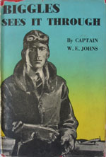
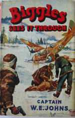
There have been eight editions of this book so far. The original edition was published in 1941 by Oxford and the latest in 1960 by Brockhampton. The book was never issued in paperback form. There have been three different designs of dustwrapper starting with a wonderful jacket illustrated by Howard Leigh, moving on to the standard flying jacket design and finally a reasonable Brockhampton Press edition.


As is common with many Oxford titles it can be difficult to work out which book is the true first edition as the book was issued three times during 1941, all dated in the same fashion with only 1941 on the copyright page. However the simplest way to find out is to first find the published date on the copyright page and make sure that it states 1941 with no other date. Then look on the half-title page. If there is an asterisk (*) then you have the first reprint or second issue; if there are two asterisks you have the second reprint or third issue. If there is no asterisk on the half-title page then you have a first edition.
However what has interested me over the last few months are the differences between the dustwrappers on these 1941 books, as the same front panel and spine was used and the spine width was not adjusted, despite the first edition being nearly two inches wide and the third issue only one inch. As the rear flap was always blank this leaves us to find the differences on the rear panel and the front flap. The price does not help as all three issues were published at 4/- net, but a careful examination leads us to find a few minor differences.


The first issue dustwrapper has the word "found" on the first line of the front flap. On the rear panel thirteen Johns titles are listed in a blue font, from 'Biggles in the Baltic' to 'Spitfire Parade' with an aerodrome above and fish below.
The second issue dustwrapper also includes the word "found" on the first line of the front flap and the rear panel has the same thirteen Johns titles listed but this time in a red font with an aeroplane above and fish below.
On the third issue dustwrapper the front flap has the word "found" on the second line and this time the rear panel has reverted back to listing the thirteen Johns titles in a blue font with an aerodrome above and fish below.
There are some other minor differences, for example, the width of the front flaps, but these are not mentioned here in detail in order to make identification as clear and as simple as possible.
As you may have noticed, there is very little difference between the wrappers and you have to be a real aficionado to be concerned about the positioning of the words on the front flap and the colour of the font on the rear panel but in my opinion these details are fascinating all the same and add another facet to the collecting of W.E. Johns's books.
(Published on 16th Apr 2016 )